Doing quality publishing on the web means caring about how you use images. There are a few things to think about.
One consideration is speed. You want photos to be compressed and a relatively small file size. But it’s also nice if they’re looking bright and sharp. It’s also really important that the photo has good Alt text and a nice title.
Compression, quality and speed
The speed with which your website loads depends, in part, on how much care you take to use small photos on your website. Faster is better. This means that smaller (in kilobytes, aka K, aka KB) is better.
One challenge for new web publishers is to understand how to measure image file size. There is the file size, measured in bytes, kilobytes or megabytes. And there’s also the photo dimension, measured in pixels. Now photos are sometimes measured in inches or centimetres. But on the web, all we really care about are pixels. A modern camera on a high resolution setting might take a photo of about 4000 pixels wide. A smart phone can take a photo that is around 3000 pixels wide.
But most websites are still under 1000 pixels. So that’s a lot of extra pixels we don’t need. And they represent a huge number of KB.
These photos are three or four times the width of a website, and will load slowly on dial up. Or on mobile. So much of the web publisher’s challenge is figuring out the best way to make your photos small enough to be easily viewable on the web.
Your goal, in most cases, is to make your photos between 200 and 800 pixels wide (or high) and under 60 KB.
JPGs are good because they compress the data in a handy way and you can often choose the amount of compression, trading off file size with photo quality. If you compress it too much then the photo might start to look a little shoddy. You can also upload GIFs or PNGs, but for the most part you probably want to stick with JPGs.
If you don’t have your own photo compression software that you’re comfortable using, try this handy online tool.
Alt text, titles, and the newest version of WordPress
The newest version of WordPress has upgraded the way photos are handled. You can just drag and drop a photo from your desktop into the page or post you’re working on.
It’s really important that you take time to properly give your photo a human readable title and human readable Alt text. Descriptions are optional. Captions are optional (I don’t like captions.) Taking the time to do this will: 1) help the visually impaired to understand the content on your site, 2) help search engines to properly index and rank your site, 3) help you keep your Media Library organized.
Writing good titles and Alt text takes a bit of practice. I recommend:
- pretend you’re a scientist describing things,
- be yourself and use your natural writing voice,
- pretend you’re describing the image over the phone to your mom,
- consider how you might try to search for the photo later,
- think about your audience; what’s their interest?
- give context for the image (is that polar bear in the zoo, or in Churchill, or in a painting, or is it stuffed and a really good example of quality taxidermy?)
- be descriptive!
A quick note on ownership
Recently I was asked about whether we can, as netizens, use images we find that don’t have copyright notes on them. One short answer is, “I wouldn’t.” Another short answer is, “it depends.”
The thing about copyright is that you don’t need to say “this is copyrighted” in order for it to be copyrighted. And this is generally good since I don’t want the images I’ve created stolen and used for profit by others. That said, if someone asked me I would probably be happy to let them use it with a credit.
But it really does depend on the context, since some images are meant to be used, re-used and remixed. So, basically, I urge respect. One way to think about this is in terms of consent (hat tip to the trans coordinator at VSAC).
One resource I like to use is the Wikimedia Commons where images are generally clearly marked with a license that makes it clear how to use it.
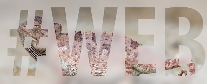
Example of a work flow
At the time of writing this post, there is a magnificent photo of a chameleon on the home page of Wikimedia Commons. It’s listed as having an Attribution-Share Alike Creative Commons License. That means I can use it as long as I give credit to the author, Yathin S. Krishnappa. I can even edit and remix it, as long as I make the edited version freely available under the same license.
So here’s what I did.
- Downloaded the full size image. It’s 3600 x 2400 pixels! And it’s 4.5 megabytes. That’s 4500KB (100 times too big).
- Then I compressed it using image editing software. The new image is only 700 x 467 pixels. More importantly, it’s only 50K.
- I drag and dropped it into this post from my desktop.
- I immediately wrote the title and alternative text. Title: Chameleon, brown lizard. Alt text: A sandy coloured lizard stands in profile, blending in remarkably well with the sand.
- Inserted the image, in the full size, without linking it to anything. For kicks, I also gave it a caption.

(Photo at top by Yathin S Krishnappa with additions by Sherwin Arnott. Creative Commons Attribution-ShareAlike.)